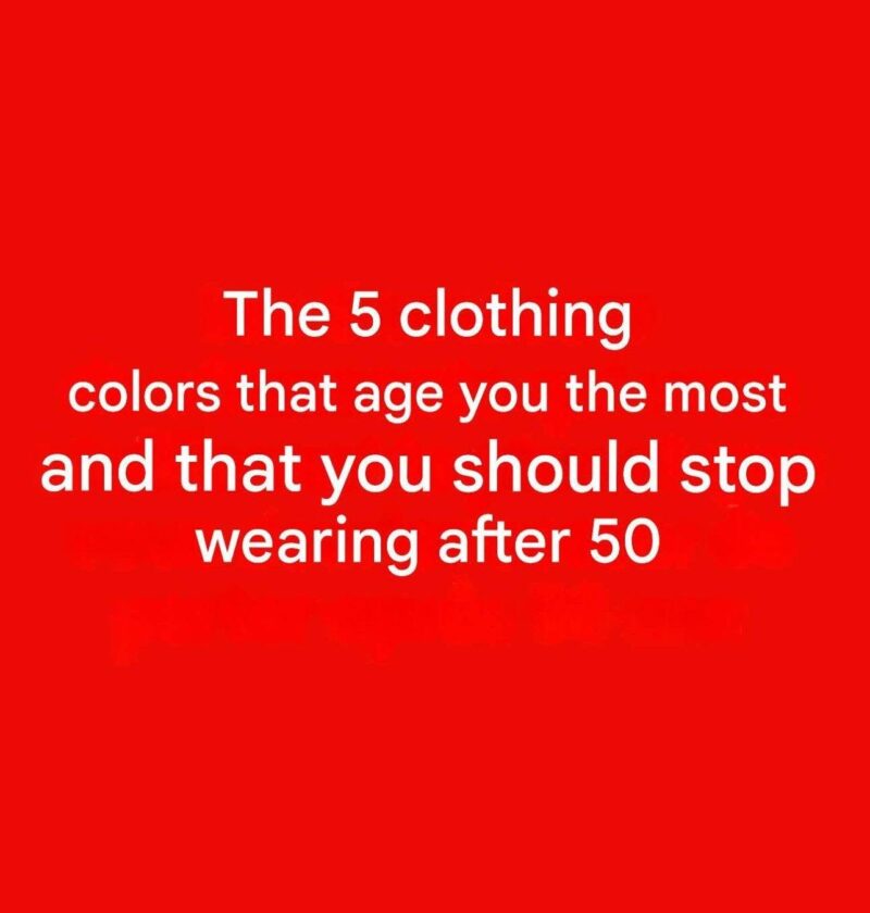
Articles with titles like “5 Colors to Avoid After 50: They Can Dull Your Glow” are usually based on style opinions, not hard rules. There is no age at which certain colors suddenly stop working. What matters most is your skin tone, hair color, eye color, contrast level, and personal style.
That said, some colors can make certain people look more tired or washed out if they are close to their skin tone or undertones:
1. Muddy Beige
If beige closely matches your skin tone, it can reduce contrast and make your complexion appear less vibrant.
2. Dull Olive Green
Some muted olive shades can emphasize sallowness or uneven skin tones, especially on people with warm undertones.
3. Harsh Neon Colors
Very bright neon shades can overpower facial features and draw attention away from the face.
4. Icy Pastels
Certain pale lavenders, pinks, or blues may wash out people with low-contrast coloring, though they can look excellent on others.
5. Stark Gray Near the Face
Some grays can make skin appear dull or emphasize shadows under the eyes, particularly if they don’t match your undertones.
Colors Often Recommended Instead
Many stylists suggest experimenting with:
- Rich teal
- Burgundy
- Plum
- Coral
- Emerald green
- Navy
- Soft camel
These shades often add contrast and warmth without being overwhelming.
A Better Rule Than “Avoid These Colors”
Rather than avoiding colors because of age, consider:
- Undertone: warm, cool, or neutral
- Contrast level: how much contrast exists between your skin, hair, and eyes
- Lighting: colors can look very different indoors versus outdoors
- Placement: a color that doesn’t flatter your face can still work for pants, skirts, or accessories
The most flattering color palette is based on your coloring, not your age. Someone over 50 can look fantastic in bright pink, black, or pastel blue if the shade suits them.